)
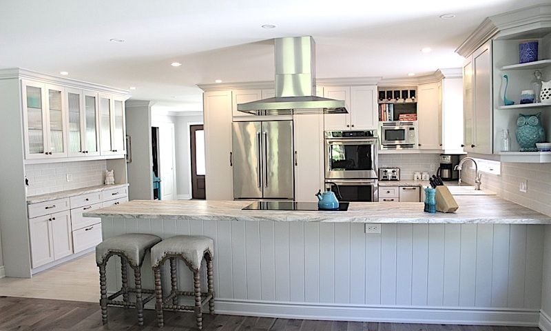
This post is dedicated to my favourite room in our newly renovated home... the kitchen. I designed it (with some suggestions from Nick) and Nick built it (with some help from me). I have no regrets when it comes to the layout or the finishes, and so I want to take a few minutes to share some of the details.
All of the cabinets are custom which allows us to take full advantage of the space, give a built-in feel to our appliances, and accomodate interior organizers galore. At Kent Carpentry, we finish our own cabinet fronts, so I was able to choose any colour of the rainbow. Although I debated going with the ever-popular white kitchen I decided on a different, but still neutral, Stonington Gray by Benjamin Moore.

The flooring is tile that imitates white-washed wood plank flooring... and the best part... it's heated!

Shaker style door and drawer fronts suited the modern country feel I wanted, while the tarnished bronze hardware from Lee Valley added a unique contrast. In my opinion, big drawers are where it's at for kitchen storage. These drawers are equipped with fully extendable slides so that things don't get lost in the depths never to be seen again as they often do in deep cupboards. Can you guess which one hides our garbage and recycling bins?

This ceramic farmer's sink from IKEA was exactly the look we were going for and the price was right. On another positive note, it has held up extremely well so far!

All of our appliances were selected from the new KitchenAid line. I picked these out at the beginning of the kitchen design process, so that I could plan the cabinets based on their exact dimensions and successfully achieve that built-in look I desired.

During our visit to our Granite supplier to select our countertops, I fell head-over-heels in love with this honed granite. Unlike it's smooth and shiny counterpart, honed granite has an earthy look, minimal sheen, and a bit of texture. It also holds up well to stains and heat.

Last but not least, we added an abundance of extra storage space in the kitchen with this custom buffet unit. I'm extremely happy with the decision to use reed glass in the upper cabinets. It's a great feature in comparision to using all solid doors, yet the texture of the glass provides some camoflage for the items I store in there.

This kitchen is not only gorgeous and spacious, it is also very functional in both layout and the use of interior cabinet organizers that allow me to take full advantage of the space. Stay tuned for a future 'Inside the Cabinet' blog.
Click here to view our Kitchen Gallery and see other kitchens by Kent Custom Carpentry.
| Tags:AdditionRenovationKitchenDesignBlogCarpentryCupboardsShelvesCustomBuilt-in |


Hamilton, Halton, Wellington, Niagara,
GTA, and the Parry Sound area.